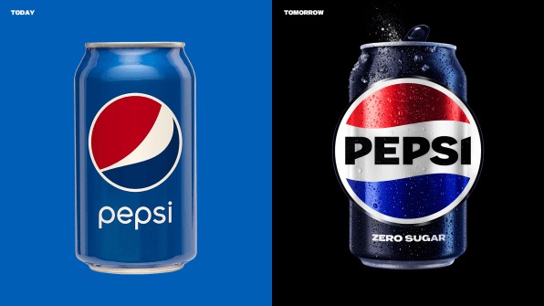
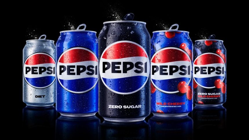
It’s the greatest Pepsi has ever looked at. The brand introduced a new logo on Tuesday that will go into effect in North America this fall and throughout the world from next year. It resembles the 1990s version quite a bit, but with updated components to make it more contemporary, such as a new border and a different font with a different color. The modifications aim to do more than just match people’s memories. But to highlight Pepsi’s zero-sugar line-which is an important aspect of the company’s expansion strategy.

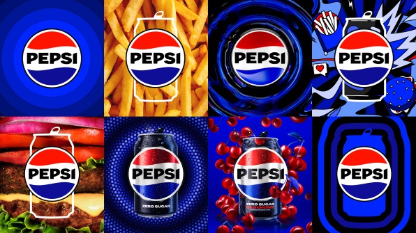
Yet the new brand is not only a play on nostalgia. Instead, the black hue—which is the same as that of Pepsi Zero Sugar—cuts through the red, white, and blue color scheme to unite the brand. This is done to separate Pepsi from its link with sugar. The “pulse” is a digital pattern that ripples out from the logo and animates to any backdrop rhythm.
The black is often overlooked, according to Todd Kaplan, CMO of Pepsi. “We purposefully included this color with Pepsi Zero Sugar, the primary brand for our marketing efforts. As a master brand statement, black might be used.
Pepsi Is Thinking About Sugar
Although PepsiCo’s income is increasing, rather than expanding its reach. This rise is primarily the result of the corporation raising the price of drinks. Since Pepsi sold its juice brands Tropicana and Naked in 2021 while investing more money in its concentrate-based SodaStream platform.

The corporation’s recent move away from sugar has represented hundreds of millions of dollars in investment and divestment for the company. In fact, the addition of black dramatically increased the visual impact of Pepsi’s imagery, helping the brand stand out in the eye-scorchingly oversaturated social media landscape and other digital contexts. Even Pepsi’s blue has improved with time. Now known as “electric blue,” it leans further towards midnight than previous Pepsi blues, almost approaching purple.


